A magazine cover photograph earns its place by doing one job at newsstand distance: stopping the eye before a single word is read. The images that manage this, issue after issue, are not accidents. They are the product of editors and art directors choosing a frame that can carry a whole story on its own.
What separates an iconic cover from a forgettable one? According to StudioBinder, photography is literally "drawing with light" — a visual medium that has existed since the 1800s and evolved in form, technology, purpose and expression. The iconic cover is that medium at its most compressed: one frame, one subject, one idea, competing against a rack of rivals for about two seconds of attention.
What makes a cover photograph work at newsstand distance?
The first requirement is clarity. A cover image is read at arm's length, sideways, half-obscured by the masthead and cover lines. That constraint pushes every decision toward simplicity: one face, one gesture, one strong shape. Busy frames lose. The eye needs a place to land, and it needs to land instantly.
The second requirement is tension. A technically clean picture of a relaxed subject rarely sells a story. The covers that endure hold something unresolved — a stare that meets the camera, a body turned slightly against the frame, light falling the wrong way. As Photography Life puts it in its beginner's guide, photographs have power, and you can see that power on "the nearest social media feed, news station, magazine article, or book cover." The cover is where that power is concentrated into a single selling image.
The third requirement is the headline handshake. A great cover photograph does not illustrate the story; it promises it. The image and the cover lines form one composition. Editors talk about the "cover moment" — the frame that makes a reader ask a question the magazine then answers inside. When the photograph and the words compete for attention, the cover fails. When they complete each other, it can run for decades in readers' memories.
How do editors and art directors actually choose the frame?
The process is closer to film editing than most readers imagine. A shoot produces hundreds of frames; the edit produces one. Art directors work through contact sheets and selects looking for a frame that survives three tests: does it read small, does it hold meaning without a caption, and does it leave room for the masthead and cover lines without amputating the subject.
That last test is the one outsiders forget. A portrait that is beautiful as a print can be unusable as a cover because the subject's eyes sit where the magazine's name needs to go. Composition on a cover is therefore a negotiation between the photograph and the page architecture — the finished cover, like the finished film, is a negotiation, not a vision.
Crop decisions carry emotional weight too. A tight crop forces intimacy; a wide crop establishes context. The same negative can produce a cover that whispers or one that shouts, and the choice is made in the layout room, not at the camera.
Why does the darkroom still matter to the cover?
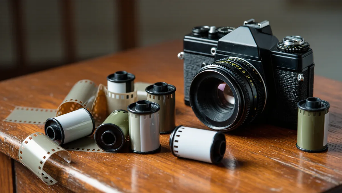
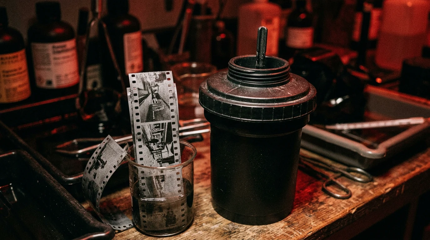
For a magazine built on film photography, the point deserves emphasis: the iconic cover image is finished after the shutter closes. As StudioBinder explains, film stock is processed through chemical development, and the medium's analog qualities — grain, texture, a wide dynamic range — remain reasons photographers still choose it over digital. Those qualities are part of why a film-shot cover can look unlike anything on the adjacent rack.
Our analysis: the printing press is the final darkroom. A photograph that looks rich on a light table can go muddy on coated paper, and art directors adjust contrast and saturation for the press run, not the screen. The cover you remember is the frame plus the paper plus the ink. Strip any one of the three and the icon weakens.
What can documentary covers teach every shooter?
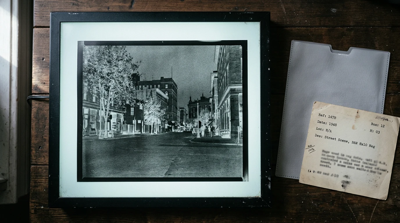
The strongest covers in the medium's history borrow the grammar of documentary work: a real moment, honestly framed, that happens to summarize something larger. Dorothea Lange's Migrant Mother portrait is the classic case study — a single frame that came to stand for an entire era, and whose negatives themselves became part of the public record. That is the cover photographer's real ambition: an image that outlives the issue it sold. This connects to our earlier piece, The Migrant Mother Negatives Are a Public Record.
The lesson transfers directly to shooters working today. Build the frame around one legible relationship — between subject and camera, subject and light, or subject and negative space. Then let the processing carry character. Grain, in the words every film shooter knows, is not a defect; on a cover printed small, it is texture that keeps the image from reading as generic stock.
Practical steps for a cover-worthy frame
Nothing here requires a studio budget. The working checklist that editors apply is one any photographer can run on their own images: For related coverage, see Inside the Studio of a Fashion Film Photographer.
- Test at thumbnail size. Shrink the frame to postage-stamp scale. If the subject still reads, the composition survives the newsstand.
- Leave dead space on purpose. Reserve one region of the frame for type. A cover photograph is shot for the page, not the wall.
- Chase one unresolved element. A question in the image — a look, a gesture, an off-balance line — is what makes a reader pick the magazine up.
- Finish for the medium. Whether you scan film or shoot digital, judge the final file against how it will actually be seen: printed, small, under shop lighting.
Exposure fundamentals still govern everything above. As Expert Photography lays out in its beginner's guide, aperture, shutter speed and ISO remain the three controls that decide what a frame looks like — and depth of field, set by aperture, is often the cover editor's favorite tool, since a shallow focus plane isolates a face from any background noise.
Why iconic covers outlive their issues
The evidence points one way. A cover becomes iconic when a simple, tension-filled frame, chosen through a hard editorial negotiation, promises a story the reader wants answered — and when the craft behind it, from the film stock to the press run, gives the image a texture nobody can fake. The magazine itself may be disposable; the image is not. That is the whole anatomy: clarity, tension, handshake, finish. Miss one and the cover is wallpaper. Land all four and the photograph stops belonging to an issue and starts belonging to the culture.