A good documentation photo does one job: it lets someone who has never stood in front of the piece judge it fairly. That means even light, honest color, and a file large enough to print. Everything else — camera brand, editing style, clever staging — is secondary.
The stakes are real. A catalog image or a portfolio shot often becomes the only version of a work most people will ever see. Archives prove the point. The finding aid for commercial photographer William F. Cone, published by the New Jersey Historical Society, describes a collection of over 9,000 glass plate negatives in 8x10, 11x14, 5x7 and 4x5 sizes that documented commerce, architecture and industry in Newark — a visual record that has outlived every client he shot for. Document your work that seriously, and it lasts that long too.
What light do I need to photograph artwork?
Soft, even, indirect light. That is the whole answer, and every technique below is a way of getting it. Hard light — a bare bulb, direct sun through a window — creates hot specular highlights on glossy paint and varnish, and deep shadows in texture. Raking light exaggerates canvas weave and brush ridges. Neither is honest.
The classic setup is two light sources placed at roughly 30 to 45 degrees from the artwork, one on each side, matched in output. That pairing cancels most specular reflections: light bouncing off the surface toward one side is balanced by the other. If you only have one light or one good window, bounce the light off a white wall or foam board so it arrives diffused, and keep the artwork parallel to the sensor plane.
Ah, and the cheapest tool in the kit: turn off every other light in the room. Mixed color temperatures — daylight from a window plus a warm household bulb — will fight your white balance for the entire session.
How do I get color right?
Color fidelity is a discipline, not a filter. Three habits get you there.
- Lock your white balance manually. Auto white balance guesses differently from frame to frame. Set a custom balance against a neutral gray card under your actual lighting, and every painting in the session inherits the same calibration.
- Put a reference target in one frame. Shoot a gray card or color chart in the same light as the artwork, at the start of the session. Later, that frame becomes your correction reference for the whole batch.
- Shoot raw. A raw file keeps the color data your camera actually captured, so you can correct without degrading the file. JPEGs throw that headroom away before you see the image.
Then calibrate your screen. If your monitor drifts, your careful color work drifts with it. A calibration tool is a one-time cost that protects every file you ever deliver. For related coverage, see Anatomy of a Film Roll's Cost.
What's the practical setup, step by step?
Here is a working sequence you can run in an afternoon with modest gear.
- Hang or lay the work square. Use a level. Even a small tilt shows up as converging edges that no crop fully forgives.
- Set the camera square to the work. Center the lens on the artwork's center. If you have a tilt-shift lens or a camera with movements, use them; if not, distance and a longer focal length reduce distortion.
- Stop down for sharpness. Wide-open lenses are soft at the edges. A mid-range aperture, around two stops down from wide open, is the usual sweet spot for flat copy work.
- Use a tripod and a self-timer or remote. Camera shake is the enemy of fine texture. For film shooters, this is where a sturdy tripod earns its keep — our cameras section covers the hardware side.
- Bracket exposure. Shoot the metered exposure, then one stop over and one under. Glossy surfaces and dark pigments often meter deceptively; the bracket catches what the meter missed.
- Check edges and corners at 100 percent. Look at the frame corners on the camera's screen, zoomed in. Corner softness and stray light leaks show up there first.
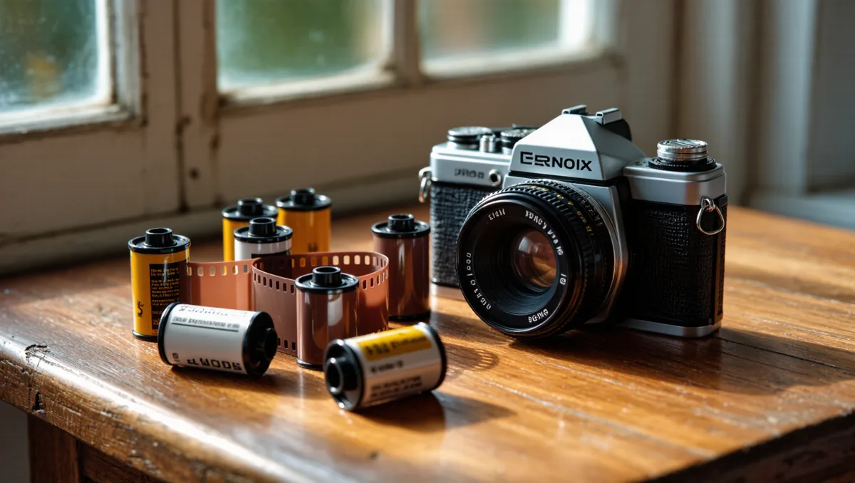
Film shooters have their own version of this discipline. Documenting artwork on film means bracketing generously and keeping notes, because there is no immediate review. The film stock you choose matters less than consistent, even exposure — a documentation negative should be boring, in the best sense.
What this means for glossy, textured and dimensional work
Not every artwork is a flat matte painting, and the setup has to bend.
- Glossy paintings and varnished surfaces. Move the lights further off-axis and lower their intensity. A polarizing filter on the lens, with polarizing material over the lights, can cut reflections almost entirely — the cross-polarization trick copy photographers have used for decades.
- Heavy texture and impasto. Slightly unequal light — one side a touch stronger — reveals stroke depth without turning it into a shadow play. Shoot a second, flatter version for the catalog and a raking version for texture, and let each do its job.
- Works on paper, prints and drawings. These are usually behind glass when displayed, but for documentation, remove the glass. Photograph the print bare. Reflections in glass cannot be fully fixed later.
- Sculpture and dimensional pieces. Add a third light or a fill card, and shoot from more than one angle. A single view cannot represent a form.
Our analysis: documentation is a craft with its own standards
Documentation photography is not lesser photography. It is a different discipline with a harder brief: remove yourself. Every artistic instinct that makes a great street photograph — the angle, the mood, the drama — works against a catalog image. The reward is different too. Done well, your documentation becomes part of the historical record.
You can see how durable that record becomes. As Rutgers University's research guide to Newark photography notes, the Library of Congress has digitized over 1,000 of Camilo Jose Vergara's photographs of Newark, and photographer Helen Stummer's decades-long documentation of the city's Central Ward is preserved in published collections and exhibitions. None of that survives by accident. Someone lit the work evenly, got the color honest, and kept the files organized.
For artists entering the market, the same standard applies. Auction houses, galleries and collectors all rely on documentation, and the money side of that trade is covered in our piece on the art market for film prints. Clean, honest files are table stakes in any of those rooms.
If you take one habit from this piece, take this one: keep a documentation log. Date, lighting setup, camera settings, film stock or file format, and any color corrections applied. Craft is judged by what the maker does when something fails, and a log is how you find out why a file drifted three years later. The darkroom taught a generation of photographers to keep process notes; digital documentation deserves the same patience.
Where to go from here
Start small. One afternoon, one artwork, two lights or one window, a gray card, and a tripod. Compare your file to the piece itself under daylight. The gap between them is your to-do list, and it shrinks fast with practice. No one gets color perfect on the first roll or the first memory card — the photographers whose work fills the archives simply kept at it, frame after frame, until the record matched the thing itself.